Industry
Music
Client
Shazam
Shazam

ENHANCING MUSIC DISCOVERY AND ENGAGEMENT ON SHAZAM
Shazam is renowned for its powerful music recognition engine. However, users typically engage for under 30 seconds, just long enough to identify a song before leaving. Our challenge was to transform Shazam from a utility into a musically engaging destination.
Our team set out to create new features that would encourage users to stay longer, explore more, and develop a deeper relationship with the music they love.
• Client: Shazam (music discovery app)
• Sprint duration: 2 weeks
• Group Project | General Assembly UX Design Bootcamp | 2025
• My Role: UX Research Lead (Discovery & Define Phases) until Ideation.
• Collaborators: Sheza and David
• Client: Shazam (music discovery app)
• Sprint duration: 2 weeks
• Group Project | General Assembly UX Design Bootcamp | 2025
• My Role: UX Research Lead (Discovery & Define Phases) until Ideation.
• Collaborators: Sheza and David
• Client: Shazam (music discovery app)
• Sprint duration: 2 weeks
• Group Project | General Assembly UX
Design Bootcamp | 2025
• My Role: UX Research Lead
(Discovery & Define Phases) until
Ideation.
• Collaborators: Sheza and David
CONTEXT
CONTEXT
• Discover: Competitive Analysis, UX audit, User Interviews, Affinity
Mapping
• Define: User Persona, Problem Statements, HMWs, Ideation
• Develop: User Scenario, User flow, Wireframing, Prototyping,
Usability Testing,
• Deliver: Hi-Fidelity Prototype, User Needs + Business Goals, 15
minute Client Presentation, Learnings and Takeaways from the
project.
• Tools: Figjam, Figma, Zoom, Slack
• Organisation Tools: Project Tracker, Milestone Calendar,
Deliverables list, Working Agreement Doc (with group roles and
responsibilities), Conflict Resolution Agreement, Statement of Work
doc, Team retro Boards, Daily Kanban Board.
• Discover: Competitive Analysis, UX
audit, User Interviews, Affinity
Mapping
• Define: User Persona, Problem
Statements, HMWs, Ideation, Feature
Prioritisation
• Develop: User Scenario, User flow,
Wireframing, Prototyping, Usability
Testing
• Deliver: Hi-Fidelity Prototype, User
Needs + Business Goals, 15 minute
Client Presentation, Learnings and
Takeaways from the project.
• Tools: Figjam, Figma, Zoom, Slack
• Organisation Tools: Project Tracker,
Milestone Calendar, Deliverables list,
Working Agreement Doc (with group
roles and responsibilities), Conflict
Resolution Agreement, Statement of
Work doc, Team retro Boards, Daily
Kanban Board.
UX SKILLS
“How might we help users stay on Shazam longer by transforming it into a more engaging, socially connected, and personalized music discovery tool?”
Despite the wealth of data Shazam collects on music preferences and listening moments, these insights were underutilized. Shazam wanted to:
• Increase session time
• Leverage existing user data for better recommendations
• Explore social and geolocation features
• Create a richer music discovery experience
“How might we help users stay on Shazam longer by transforming it into a more engaging, socially connected, and personalized music discovery tool?”
Despite the wealth of data Shazam collects on music preferences and listening moments, these insights were underutilized. Shazam wanted to:
• Increase session time
• Leverage existing user data for better
recommendations
• Explore social and geolocation
features
• Create a richer music discovery
experience
THE CHALLENGE
• A Mood Wheel: Users can assign a mood to a song and then are
recommended more songs related to that mood. (This will be based on the
data of what songs other users have assigned to this mood)
• A Song Discovery Hotspot Map (Gamification) : A geolocation feature that
lets users discover and collect songs that other users have shazam’d in their
vicinity, allowing them to earn tokens for every new song discovered and
collected. The tokens can then be used to redeem rewards in the app.
Provide value-adding user experience by enhancing song discovery engagement. We did this by introducing two new features in Shazam.
Provide value-adding user experience by enhancing song discovery engagement. We did this by introducing two new features in Shazam.
• A Mood Wheel: Users can assign a
mood to a song and then are
recommended more songs related to
that mood. (This will be based on the
data of what songs other users have
assigned to this mood)
• A Song Discovery Hotspot Map
(Gamification) : A geolocation feature
that lets users discover and collect
songs that other users have shazam’d
in their vicinity, allowing them to earn
tokens for every new song discovered
and collected. The tokens can then be
used to redeem rewards in the app.
THE SOLUTION
DISCOVER
The key research methods we used to understand Shazam and their users were as follows:
UX/Content Audit of the existing app
Competitor Analysis
User Interviews
Shazam nails the recognition moment
but once the song is discovered, there is nothing else that would make the users stay. Songs can only be previewed so the users jump to other apps like apple music to listen to song.
Our main purpose for conducting the UX audit on the app was to find out what shazam are already doing and not doing for music engagement. We found that:
Our main purpose for conducting the UX audit on the app was to find out what shazam are already doing and not doing for music engagement. We found that:
Our main purpose for conducting the UX audit on the app was to find out what shazam are already doing and not doing for music engagement. We found that:
UX AUDIT
Geolocation data is underused
It Tags location and time when a user Shazams a song but not using this data to engage users in the app very well. Currently only uses location data to show regional music charts and upcoming local concerts.
No Social Layer or Emotional Connection
There are no in-app ways to connect with friends, share playlists, or see what your friends are shazaming. This makes the experience functional but also solitary.
Geolocation data is underused
It Tags location and time when a user Shazams a song but not using this data to engage users in the app very well. Currently only uses location data to show regional music charts and upcoming local concerts.
Song Recommendations exist, but they feel distant
Shazam offers some suggestions like related tracks but they’re generic and lack context (mood, activity etc,).
Shazam offers some suggestions like related tracks but they’re generic and lack context (mood, activity etc,).
No Social Layer or Emotional Connection
There are no in-app ways to connect with friends, share playlists, or see what your friends are shazaming. This makes the experience functional but also solitary.


THE MOOD WHEEL
These insights revealed a clear opportunity: Shazam identifies music, but doesn’t help users emotionally connect, revisit, or socially share their discoveries.
This became the foundation for our two key feature concepts:
To better understand where Shazam stands in the music discovery landscape, we conducted a competitive analysis and SWOT analysis, comparing it with key players like Spotify, SoundCloud, Apple Music, and Audiomack.
Our goal with this was to identify what Shazam does well, where it falls short, and what gaps exist across the user experience.
THE SONG DISCOVERY MAP
These insights revealed a clear opportunity: Shazam identifies music, but doesn’t help users emotionally connect, revisit, or socially share their discoveries.
This became the foundation for our two key feature concepts:
COMPETITOR ANALYSIS
To better understand where Shazam stands in the music discovery landscape, we conducted a competitive analysis and SWOT analysis, comparing it with key players like Spotify, SoundCloud, Apple Music, and Audiomack.
Our goal with this was to identify what Shazam does well, where it falls short, and what gaps exist across the user experience.
Discovery Depth is Limited
Unlike Spotify (algorithmic playlists) or SoundCloud (user-uploaded content), Shazam offers minimal exploration beyond artist tags or top charts. It lacks curated playlists or rich browsing experiences.
No Built in Social Features
While competitors allow sharing playlists, following friends, or commenting on tracks, Shazam has no social layer.
Weak Personalization & Retention
Personalization is limited to recently tagged songs. In contrast, Spotify offers Discover Weekly, SoundCloud surfaces tracks from followed artists, and Audiomack suggests based on user taste.
Personalization is limited to recently tagged songs. In contrast, Spotify offers Discover Weekly, SoundCloud surfaces tracks from followed artists, and Audiomack suggests based on user taste.
Geolocation is Passive
Shazam collects geolocation data to power city-based charts (e.g. “Top 50 in London”), but doesn’t use this for personalized discovery or regional storytelling—unlike Spotify's event-based playlists or Audiomack's regional trending music.
No Community Tools
Competing apps build loyalty through community features like collaborative playlists (Spotify), reposts and comments (SoundCloud), or likes and follows (Audiomack). Shazam currently offers none.
Competing apps build loyalty through community features like collaborative playlists (Spotify), reposts and comments (SoundCloud), or likes and follows (Audiomack). Shazam currently offers none.
THE MOOD WHEEL
THE SONG DISCOVERY MAP


No Built in Social Features
While competitors allow sharing playlists, following friends, or commenting on tracks, Shazam has no social layer.
Geolocation is Passive
Shazam collects geolocation data to power city-based charts (e.g. “Top 50 in London”), but doesn’t use this for personalized discovery or regional storytelling—unlike Spotify's event-based playlists or Audiomack's regional trending music.
THE SONG DISCOVERY MAP
This discovery phase helped us define what users truly need to stay engaged with a music app and guided us in designing features for Shazam that respond to those needs and can be tested for impact.
Users like engaging with music apps that have community and sharing features. (Users like discovering what their friends are listening to and jamming with them on spotify for example)
"It’s like social media, but not really... like seeing what your friends are listening to."
Users like engaging with music apps that are good at personalising song recommendations
“Spotify creates a playlist for you, for every different kind of vibe you’re in."
“Spotify creates a playlist for you, for every different kind of vibe you’re in."
“Spotify creates a playlist for you, for every different kind of vibe you’re in."
This discovery phase helped us define what users truly need to stay engaged with a music app and guided us in designing features for Shazam that respond to those needs and can be tested for impact.
These are the key insights we found that would help us build Shazam’s new features to make our users engage more with the app:
These are the key insights we found that would help us build Shazam’s new features to make our users engage more with the app:
To go beyond assumptions and ground our design direction in real behavior, we conducted user interviews with the goal of understanding how people discover music, engage with music apps, and relate to their listening habits emotionally and socially. We used a semi-structured script focused on discovery journeys, frustrations, Shazam usage, and desired features. We then used these insights from the interviews and affinity mapping to figure out the main ways in which people stay engaged with music apps and how we could bring that into Shazam but with a twist.
USER INTERVIEWS
This discovery phase helped us define what users truly need to stay engaged with a music app and guided us in designing features for Shazam that respond to those needs and can be tested for impact.
DEFINE
We then moved onto the define phase where I synthesised all the research data into leverageable insights.
User Persona
Problem Statements and HMWs
Design Studio
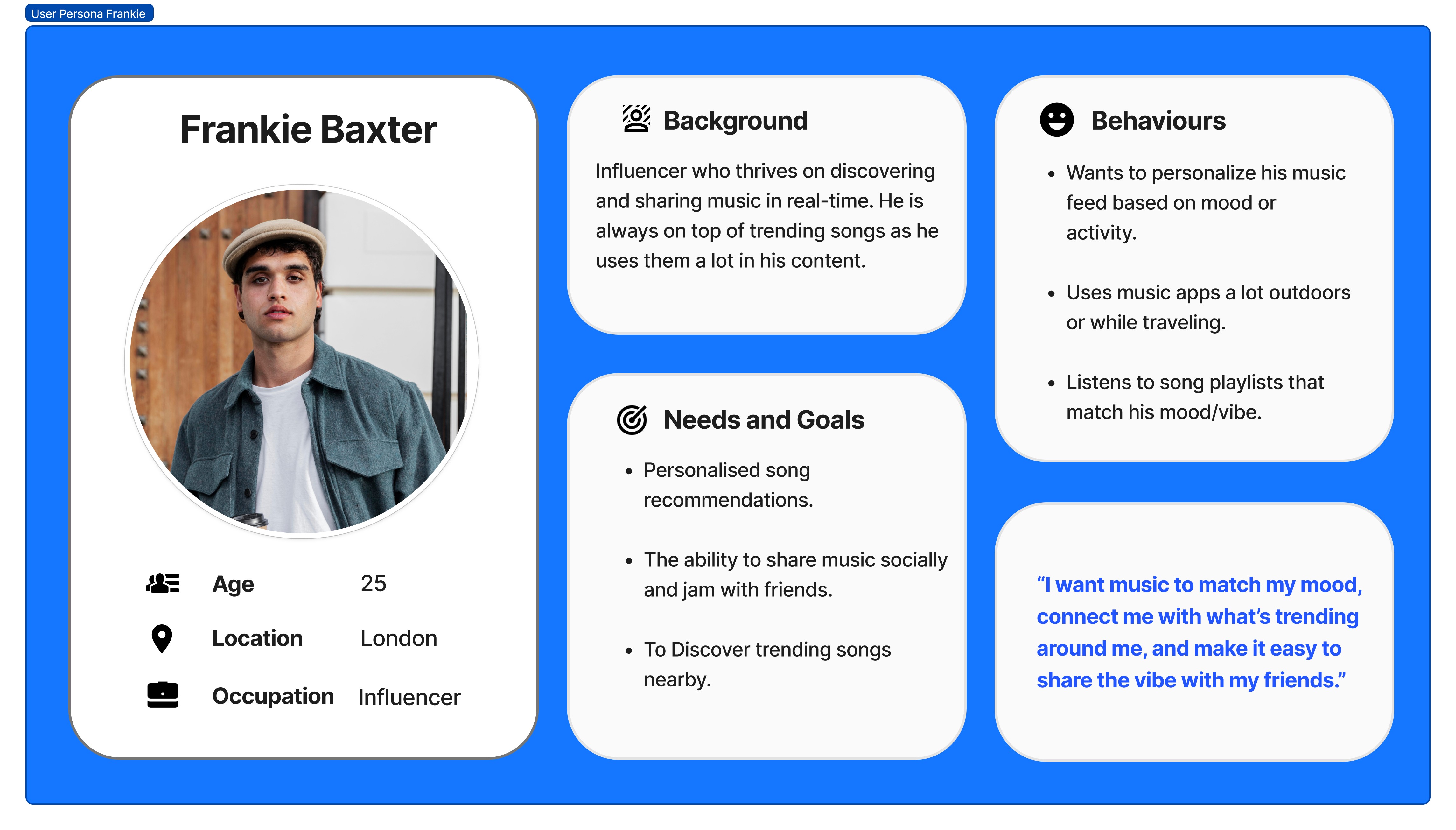
By distilling the recurring patterns from our user interviews, we were able to shape a clear picture of our target user’s motivations and what keeps them engaged.
This persona gave us a constant point of reference someone we could return to throughout the project to sense-check ideas, align with user needs, and ensure that our solutions addressed the real gaps in music discovery, personalisation, and engagement.
Meet Frankie.
USER PERSONA
Before moving into ideation, we crafted clear problem statements to help pinpoint how we could better engage Frankie with Shazam.
These statements were shaped by his key needs: mood-based discovery, local music trends, and effortless sharing and helped us stay focused on designing solutions that aligned with how he actually wants to experience and explore music.
How might we help Frankie discover songs on the go by showcasing what songs other users have Shazamed nearby?
How might we help Frankie find cool new songs he has not heard of before that match his current mood by using Shazam’s database?
We then drafted HMW questions to think of potential solutions to the problems. We narrowed down to a couple main ones we wanted to focus on.
We then drafted HMW questions to think of potential solutions to the problems. We narrowed down to a couple main ones we wanted to focus on.
Frankie wants to discover new music that matches his current mood,
but his current app keeps recommending similar songs based on past behavior, making the experience feel repetitive and uninspiring.
Frankie wants to explore what music is trending around him, so he can better connect with the community around him
but most platforms only offer broad, national-level charts,making it difficult to connect with the local music culture or community while on the go.
HMW
Frankie wants to discover new music that matches his current mood,
but his current app keeps recommending similar songs based on past behavior, making the experience feel repetitive and uninspiring.
How might we help Frankie find cool new songs he has not heard of before that match his current mood by using Shazam’s database?
How might we help Frankie discover songs on the go by showcasing what songs other users have Shazamed nearby?
Before moving into ideation, we crafted clear problem statements to help pinpoint how we could better engage Frankie with Shazam.
These statements were shaped by his key needs: mood-based discovery, local music trends, and effortless sharing and helped us stay focused on designing solutions that aligned with how he actually wants to experience and explore music.
PROBLEM STATEMENT & HMW
Frankie wants to discover new music that matches his current mood,
but his current app keeps recommending similar songs based on past behavior, making the experience feel repetitive and uninspiring.
HMW
With our problem defined, we turned to opportunity.
As a group, we used “How Might We” questions to reframe our challenges and guide ideation. From many, two stood out clearly aligning with Frankie’s needs and shaping the features we designed next.
How might we help Frankie find cool new songs he has not heard of before that match his current mood by using Shazam’s database?
How might we help Frankie discover songs on the go by showcasing what songs other users have Shazamed nearby?
HMW
Frankie wants to explore what music is trending around him, so he can better connect with the community around him
but most platforms only offer broad, national-level charts,making it difficult to connect with the local music culture or community while on the go.
Frankie wants to explore what music is trending around him, so he can better connect with the community around him
but most platforms only offer broad, national-level charts,making it difficult to connect with the local music culture or community while on the go.
Gamified Song discovery map (Shazam Hotspots)
Like POKEMON GO for shazamed songs in your vicinity
(arrive at spot → discover song → earn token → use tokens to redeem rewards )
User gets notified when they are in an area with many Shazam activities.
As users approach the “hotspot”, the app will reveal the most Shazamed song in the area of the week.
User can then see leaderboard of the most Shazamed songs in the hotspot.
To kick off ideation, we ran a fast-paced design studio focused on our “How Might We” questions.
Each team member first brainstormed ideas individually, then we came together to share, expand, and build on each other’s thinking. Through group discussion and a final vote, we narrowed it down to two standout concepts that best addressed our user’s needs.
KEY IDEAS:
DESIGN STUDIO
Mood Emoji Wheel for song recommendations
User Shazams a song and it comes with a preset mood label based on what other users have labeled when they Shazamed the song.
Users can label song with mood through a “mood wheel” with 6 - 8 preset emojis.
Shazam then recommends songs based on the song and the assigned mood.
Gamified Song discovery map (Shazam Hotspots)
Like POKEMON GO for shazamed songs in your vicinity
(arrive at spot → discover song → earn token → use tokens to redeem rewards )
User gets notified when they are in an area with many Shazam activities.
As users approach the “hotspot”, the app will reveal the most Shazamed song in the area of the week.
User can then see leaderboard of the most Shazamed songs in the hotspot.
DEVELOP
We then moved into developing our two ideas into tangible user experiences.
To do this, we first wrote a user scenario for each concept, which helped us map out user flows and define how and where these features would live within the existing Shazam app. We also explored the best ways to introduce these features to users in-app, ensuring they felt intuitive and known. This phase culminated in building interactive prototypes, which we tested with users and iterated based on their feedback.
User Scenarios
User Flows
Usability Testing on Initial Prototype
Developing Prototype based on feedback
We began by writing a user scenario for each idea (the Mood Wheel and the Discovery Map). These user stories helped us ground the feature in real-world context and understand why, when, and how Frankie (our user) would interact with it.
We began by writing a user scenario for each idea (the Mood Wheel and the Discovery Map). These user stories helped us ground the feature in real-world context and understand why, when, and how Frankie (our user) would interact with it.
USER SCENARIO
User Scenario 2 – The Shazam Discovery Map
While out with friends, Frankie gets a push notification from Shazam alerting him to a nearby “hotspot” where lots of songs have been recently Shazamed. He follows the map, taps the pulsing Shazam button at the location, and unlocks the most popular track in that area—plus some bonus tokens. He browses other Shazamed songs and checks which rewards he can redeem with the tokens he has collected so far. The map becomes a way for him and his friends to keep exploring and collecting music based on local trends while also being rewarded for their discoveries.
User Scenario 1 – The Mood Wheel
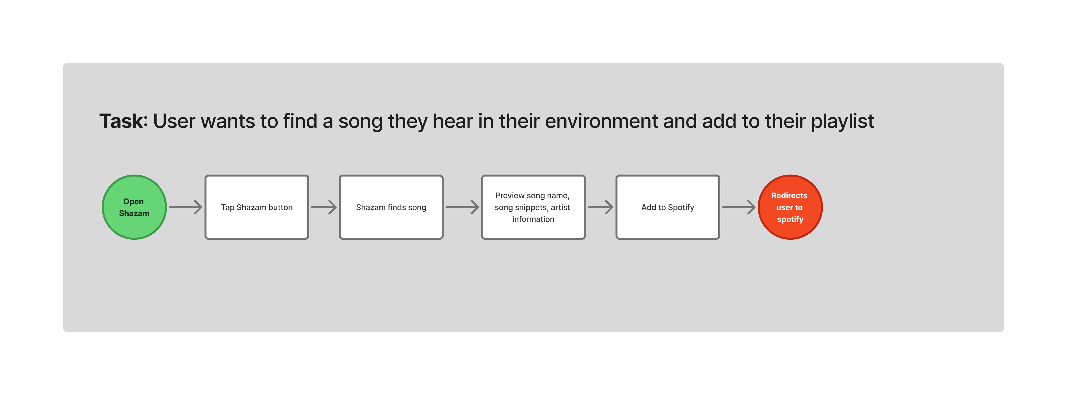
While relaxing at a café, Frankie hears a song he likes and opens Shazam as usual. After identifying the track, he’s notified about a new feature, the Mood Wheel. Curious, he selects an emoji that reflects the mood of the song he shazamed, which then generates a playlist of songs that match that mood. He discovers new tracks, previews a few, and adds them to his Apple Music playlist.
User Scenario 1 – The Mood Wheel
While relaxing at a café, Frankie hears a song he likes and opens Shazam as usual. After identifying the track, he’s notified about a new feature, the Mood Wheel. Curious, he selects an emoji that reflects the mood of the song he shazamed, which then generates a playlist of songs that match that mood. He discovers new tracks, previews a few, and adds them to his Apple Music playlist.
User Scenario 2 – The Shazam Discovery Map
While out with friends, Frankie gets a push notification from Shazam alerting him to a nearby “hotspot” where lots of songs have been recently Shazamed. He follows the map, taps the pulsing Shazam button at the location, and unlocks the most popular track in that area—plus some bonus tokens. He browses other Shazamed songs and checks which rewards he can redeem with the tokens he has collected so far. The map becomes a way for him and his friends to keep exploring and collecting music based on local trends while also being rewarded for their discoveries.
User Scenario 1 – The Mood Wheel
While relaxing at a café, Frankie hears a song he likes and opens Shazam as usual. After identifying the track, he’s notified about a new feature, the Mood Wheel. Curious, he selects an emoji that reflects the mood of the song he shazamed, which then generates a playlist of songs that match that mood. He discovers new tracks, previews a few, and adds them to his Apple Music playlist.
User Scenario 2 – The Shazam Discovery Map
While out with friends, Frankie gets a push notification from Shazam alerting him to a nearby “hotspot” where lots of songs have been recently Shazamed. He follows the map, taps the pulsing Shazam button at the location, and unlocks the most popular track in that area—plus some bonus tokens. He browses other Shazamed songs and checks which rewards he can redeem with the tokens he has collected so far. The map becomes a way for him and his friends to keep exploring and collecting music based on local trends while also being rewarded for their discoveries.

Using the scenarios, we sketched out user flows to visualise how Frankie would move through the app, from landing on Shazam to interacting with the new features.
USER FLOWS
User Flow 1 (Interaction with Mood Wheel)
User Flow 2 (Interaction with Shazam discovery map)
User Flow 1 (Interaction with Mood Wheel)
User Flow 2 (Interaction with Shazam discovery map)
User Flow 2 (Interaction with Shazam discovery map)
User Flow 1 (Interaction with Mood Wheel)


The Mood Wheel (usability insights)
The emoji button was not intuitive as a clickable feature.
“I couldn’t tell that the emoji was a
button and once clicked would
expan into an emoji wheel”
The feature needed some kind of onboarding or contextual explanation. Without an intro tooltip or prompt, users weren’t sure why mood needed to be selected or what it affected.
“Wasn’t super clear on why I need to
assign a mood , it might make more
sense if it had a tooltip/text to
introduce this feature.”
Users expected a separate, more visual playlist view after selecting a mood. There was a disconnect between mood selection and the song results; it lacked clarity and feedback.
“Expect recommended songs following mood selection on another screen.”
Once we had the user flows, we translated our ideas into mid-fidelity prototypes in Figma. We then conducted several usability tests, gathered feedback, and made iterative design changes based on the most common insights we gathered from our usability data.
USABILITY TESTING (INITIAL PROTOTYPE)
Shazam Discovery Map (usability insights)
Users liked the gamification but didn’t understand how tokens were earned or tracked. Was it from clicking a hotspot, walking there, or Shazamming songs?
No clear introduction that this was a game or how to participate.
Unclear whether they were physically meant to move or just virtually travel on map to get to the shazam hotspots.
Users expected to see leaderboards or top 5 shazamed songs in the hotspot.
Some elements (like token icons or map markers) were ambiguous.
The Mood Wheel (usability insights)
The emoji button was not intuitive as a clickable feature.
“I couldn’t tell that the emoji was a
button and once clicked would expand
into an emoji wheel”
The feature needed some kind of onboarding or contextual explanation. Without an intro tooltip or prompt, users weren’t sure why mood needed to be selected or what it affected.
“Wasn’t super clear on why I need to
assign a mood , it might make more
sense if it had a tooltip/text to
introduce this feature.”
Users expected a separate, more visual playlist view after selecting a mood. There was a disconnect between mood selection and the song results; it lacked clarity and feedback.
“Expect recommended songs following mood selection on another screen.”
Users liked the gamification but didn’t understand how tokens were earned or tracked. Was it from clicking a hotspot, walking there, or Shazamming songs?
No clear introduction that this was a game or how to participate.
Unclear whether they were physically meant to move or just virtually travel on map to get to the shazam hotspots.
Users expected to see leaderboards or top 5 shazamed songs in the hotspot.
Some elements (like token icons or map markers) were ambiguous.
Shazam Discovery Map (usability insights)
The Mood Wheel (usability insights)
The emoji button was not intuitive as a clickable feature.
“I couldn’t tell that the emoji was a
button and once clicked would expand
into an emoji wheel”
The feature needed some kind of onboarding or contextual explanation. Without an intro tooltip or prompt, users weren’t sure why mood needed to be selected or what it affected.
“Wasn’t super clear on why I need to
assign a mood , it might make more
sense if it had a tooltip/text to
introduce this feature.”
Users expected a separate, more visual playlist view after selecting a mood. There was a disconnect between mood selection and the song results; it lacked clarity and feedback.
“Expect recommended songs following mood selection on another screen.”
The Mood Wheel (usability insights)
Shazam Discovery Map (usability insights)
Users liked the gamification but didn’t understand how tokens were earned or tracked. Was it from clicking a hotspot, walking there, or Shazamming songs?
No clear introduction that this was a game or how to participate.
Unclear whether they were physically meant to move or just virtually travel on map to get to the shazam hotspots.
Users expected to see leaderboards or top 5 shazamed songs in the hotspot.
Some elements (like token icons or map markers) were ambiguous.
DELIVER
Final Prototype
Heart Framework
Key Learnings
Conclusion
After usability testing, we made key refinements to both features to improve clarity, engagement, and overall usability. Our focus was on making each interaction more intuitive while aligning with user expectations uncovered during testing.
Final Prototype